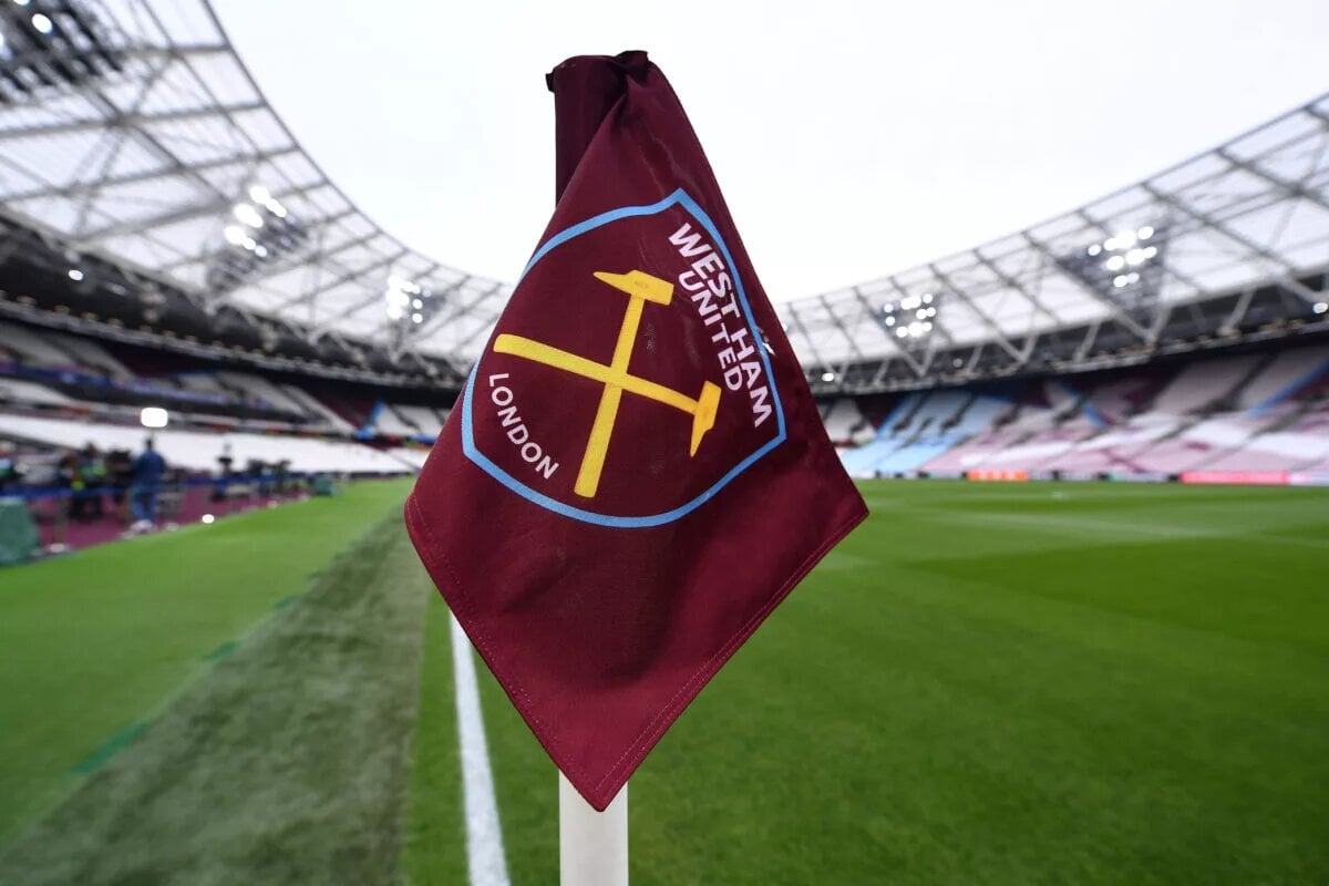

WEST HAM REVEAL THREE NEW OPTIONS TO REPLACE THE CLUB CREST.
West Ham United Football Club has always been more than just a football team; it is a cultural institution rooted in East London’s working-class heritage. The crest, a symbol worn proudly by generations of supporters, embodies the club’s identity. Now, in 2026, West Ham has revealed three new crest options, sparking debate and excitement among fans. This redesign marks the most significant identity review since 2016, when the club moved to London Stadium and introduced its current emblem.
Historical Context: The Crest as a Symbol of Heritage.
The story of West Ham’s crest is inseparable from the club’s origins. Founded in 1895 as Thames Ironworks FC, the team’s earliest symbols reflected its industrial roots. The crossed hammers, representing the tools of shipbuilders and ironworkers, became the defining motif. Over the decades, the crest evolved, incorporating elements such as castles, towers, and shields, each iteration reflecting a balance between tradition and modernity.
– Pre-1960s Crests: Complex designs featuring castles and hammers.
– 1960s–1980s: Simplified shields with bold claret and blue colors.
– 1999–2016: A detailed crest with the Boleyn Castle, tying the club to its historic ground.
– 2016–Present: A minimalist claret shield with crossed hammers and “London” at the base, introduced during the move to London Stadium.
Ten years later, the club is asking: does the current crest still capture the essence of West Ham?
Why the Change?
Several factors have driven the decision to explore new crest options:
– Anniversary Reflection: Ten years since the current crest was introduced.
– Fan Engagement: Supporters want a stronger voice in shaping the club’s identity.
– Cultural Reset: Following relegation to the EFL Championship in 2026/27, the club seeks to reconnect with its roots.
– Commercial Considerations: Updating merchandise and branding for a new era.
This is not just a design exercise; it is a symbolic reset at a pivotal moment in West Ham’s history.
The Consultation Process
The redesign is being led by the Fan Advisory Board (FAB), ensuring transparency and independence. The process includes:
– Initial discussions with FAB.
– Broader consultation with season ticket holders and Claret members.
– Engagement with fans attending five or more home matches in 2025/26.
– Final decision during the 2026/27 season.
The new crest will be implemented in the 2028/29 season, allowing ample time for refinement and merchandise rollout.
The Three Crest Options
1. Ironworks Revival
– Prominent crossed hammers.
– Industrial motifs reflecting Thames Ironworks heritage.
– Strong emphasis on tradition and working-class roots.
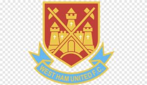
2. Boleyn Tribute
– Incorporates Anne Boleyn’s Tower silhouette.
– Pays homage to the historic Boleyn Ground, demolished in 2016.
– Nostalgic design appealing to long-time supporters.
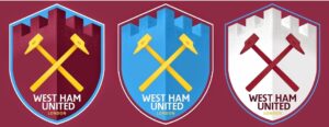
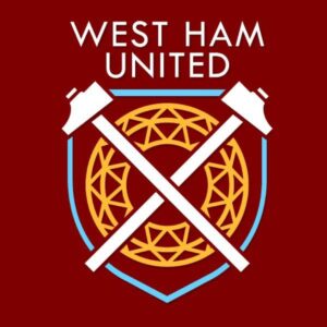
3. Modern Minimalist
– Sleek shield with simplified typography.
– Digital-first design optimized for global branding.
– Balances tradition with contemporary aesthetics.
Risks and Challenges
Changing a crest is never without controversy. Potential challenges include:
– Fan Division: Some supporters may resist altering a familiar symbol.
– Commercial Risks: Merchandise redesigns require significant investment.
– Cultural Sensitivity: Balancing East London heritage with global ambitions.
Current Club Situation
West Ham’s crest redesign coincides with a turbulent period:
– Relegation: The club was relegated to the EFL Championship for the 2026/27 season, ending a 14-year Premier League run.
– European Success: The 2023 UEFA Europa Conference League victory remains a recent high point.
– Rebuilding Phase: The crest redesign is part of a broader reset, aiming to strengthen identity and morale.
Fan Involvement
The consultation process ensures that fans are at the heart of the decision. By involving supporters at every stage, West Ham aims to create a crest that reflects collective identity rather than corporate branding. This is crucial in maintaining trust and loyalty during a period of transition.
Cultural Significance
The crest is more than a badge; it is a cultural marker. For East Londoners, it represents resilience, pride, and community. For global fans, it is a symbol of belonging. The choice between Ironworks Revival, Boleyn Tribute, and Modern Minimalist is essentially a choice between nostalgia and modernity.
Conclusion
West Ham’s crest consultation is a defining moment in the club’s history. The three options—Ironworks Revival, Boleyn Tribute, and Modern Minimalist—offer fans a chance to shape the future identity of the Hammers. The final decision will not only determine the club’s visual identity but also reinforce the bond between West Ham and its supporters.
This is more than a design change; it is a cultural reset, a chance to honor the past while embracing the future. Whatever crest emerges in 2028/29, it will carry the weight of history, the voice of fans, and the spirit of East London.